








On October 1st, according to a post from tech media 9to5Google yesterday (September 30th), Apple has released a beta version 7.0 of its Apple Music app for the Android platform, introducing the "Liquid Glass" design language for the first time on Android one year after its launch on the iOS platform.
In terms of appearance, the Android 7.0 beta version Apple Music now features a floating bottom bar that allows users to see content at the top, bottom, and on both sides simultaneously.
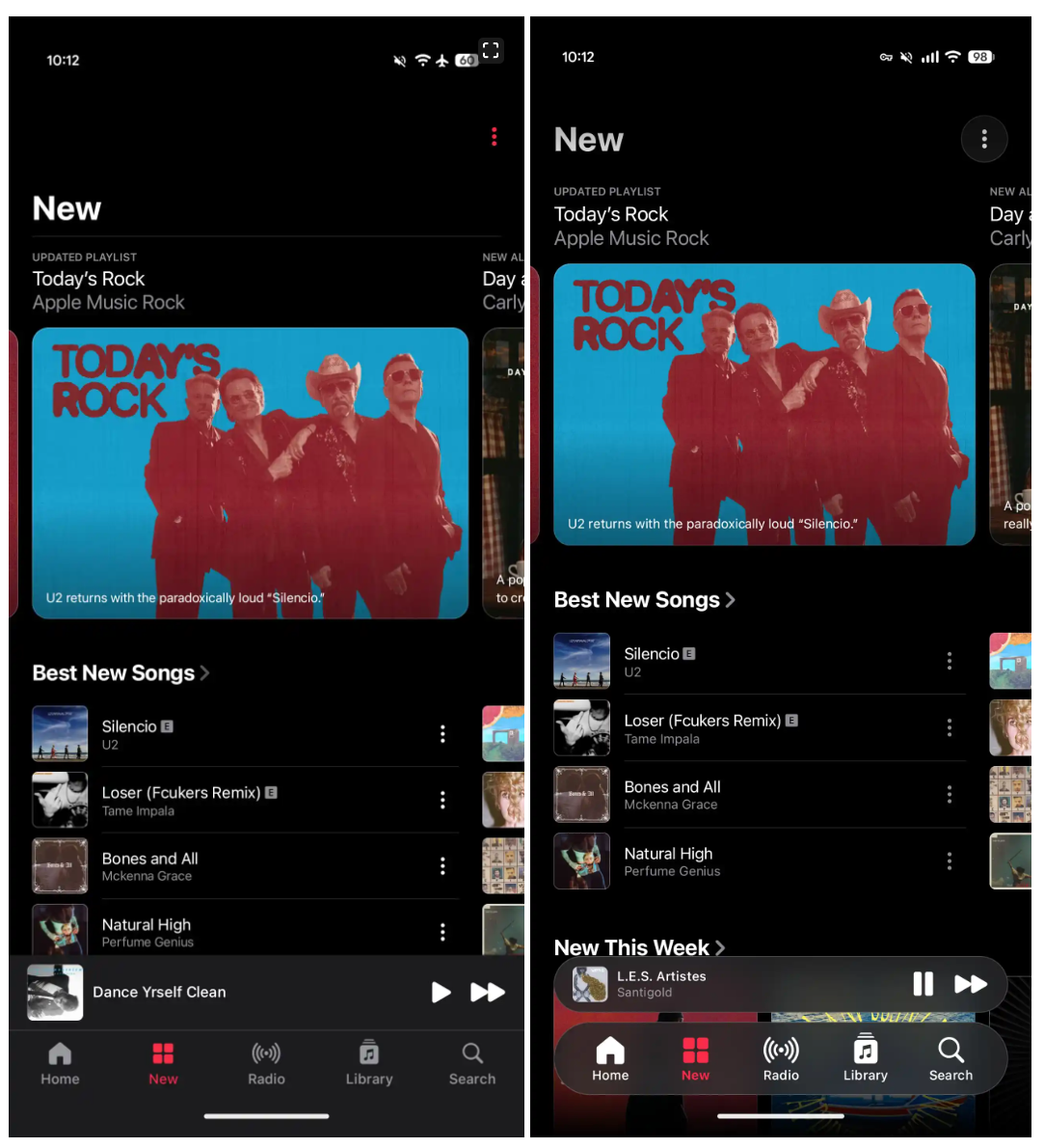
The navigation bar has a slight semi-transparent effect, allowing users to see the solid-color background below it. Unlike the iOS version, scrolling the screen does not cause the bottom bar to fold into a more compact form; all content remains in its original position. The small player at the top is treated in the same way and no longer aligns with the bottom bar.
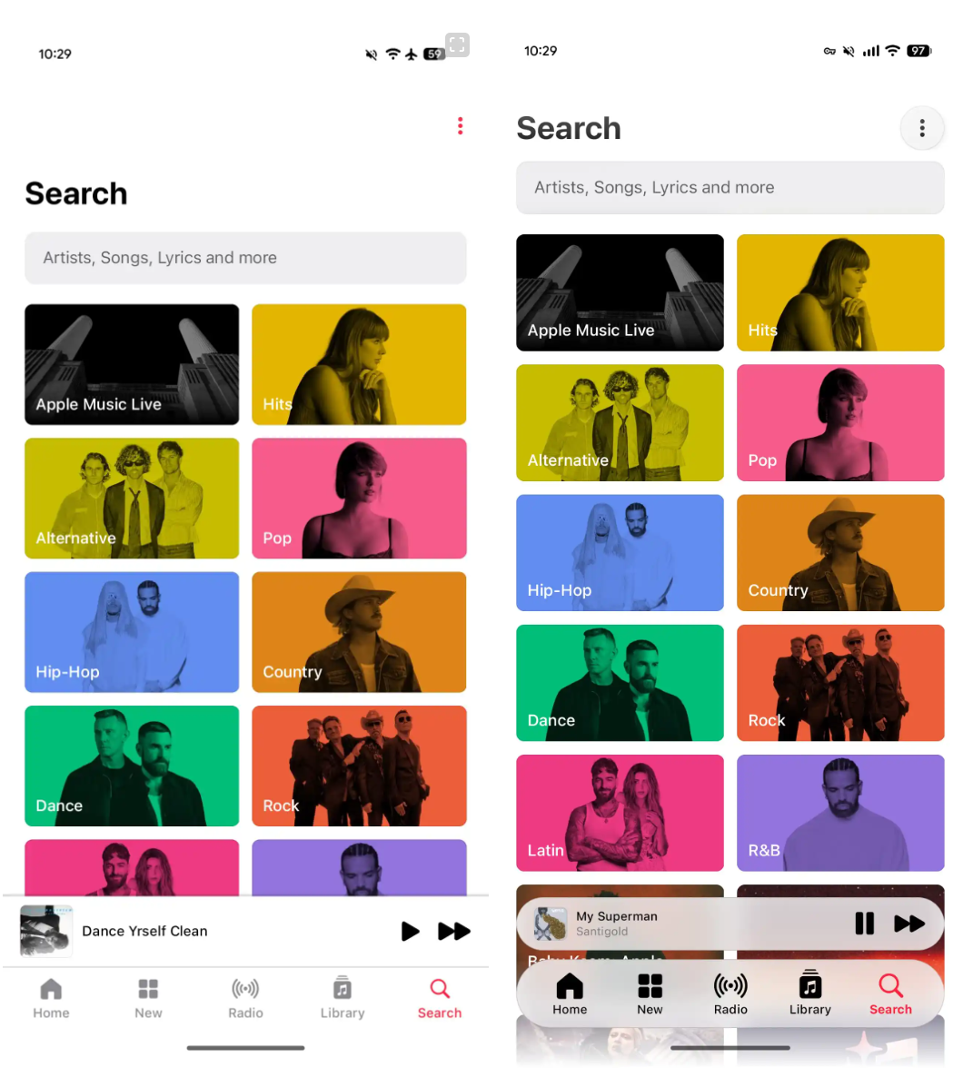
The top bar of the application has been updated, with the page title and the overflow menu items now placed on the same line. The three-dot icon is no longer red; instead, it is placed within a circular container. The "Library" tab has undergone the most significant changes. "Edit Fixed Items" ( Edit Pins ) and "Edit Categories" ( Edit Categories ) have now been moved to the overflow menu (referring to the "⋮" icon in the upper right corner of the interface, which expands to show more options when clicked).
The new version also improves the artist page, with the background being themed according to the cover image. This is more in line with the design style of iOS. The play button is now more prominent, and the information page is no longer located at the bottom of the page. The share button has been moved to the top right corner. Here are the relevant images from the IT home:
The page has been modernized, with a more logical grouping of elements. There are no significant changes to the playback functionality, and version iOS has also not undergone any major updates. The status bar and navigation bar of Apple Music 7.0 now feature an edge-to-edge design.